Cashu redeem looks ugly #718
Labels
No Label
1000k
100k
10k
200k
20k
500k
50k
5k
75k
backend
blocked:design
bug
dependencies
documentation
duplicate
enhancement
good first issue
help wanted
invalid
P1
P2
P3
question
scope:intl
scope:nip
scope:query_tracing
scope:ux
wontfix
No Milestone
No project
No Assignees
1 Participants
Notifications
Due Date
No due date set.
Dependencies
No dependencies set.
Reference: Kieran/snort#718
Loading…
Reference in New Issue
No description provided.
Delete Branch "%!s(<nil>)"
Deleting a branch is permanent. Although the deleted branch may continue to exist for a short time before it actually gets removed, it CANNOT be undone in most cases. Continue?
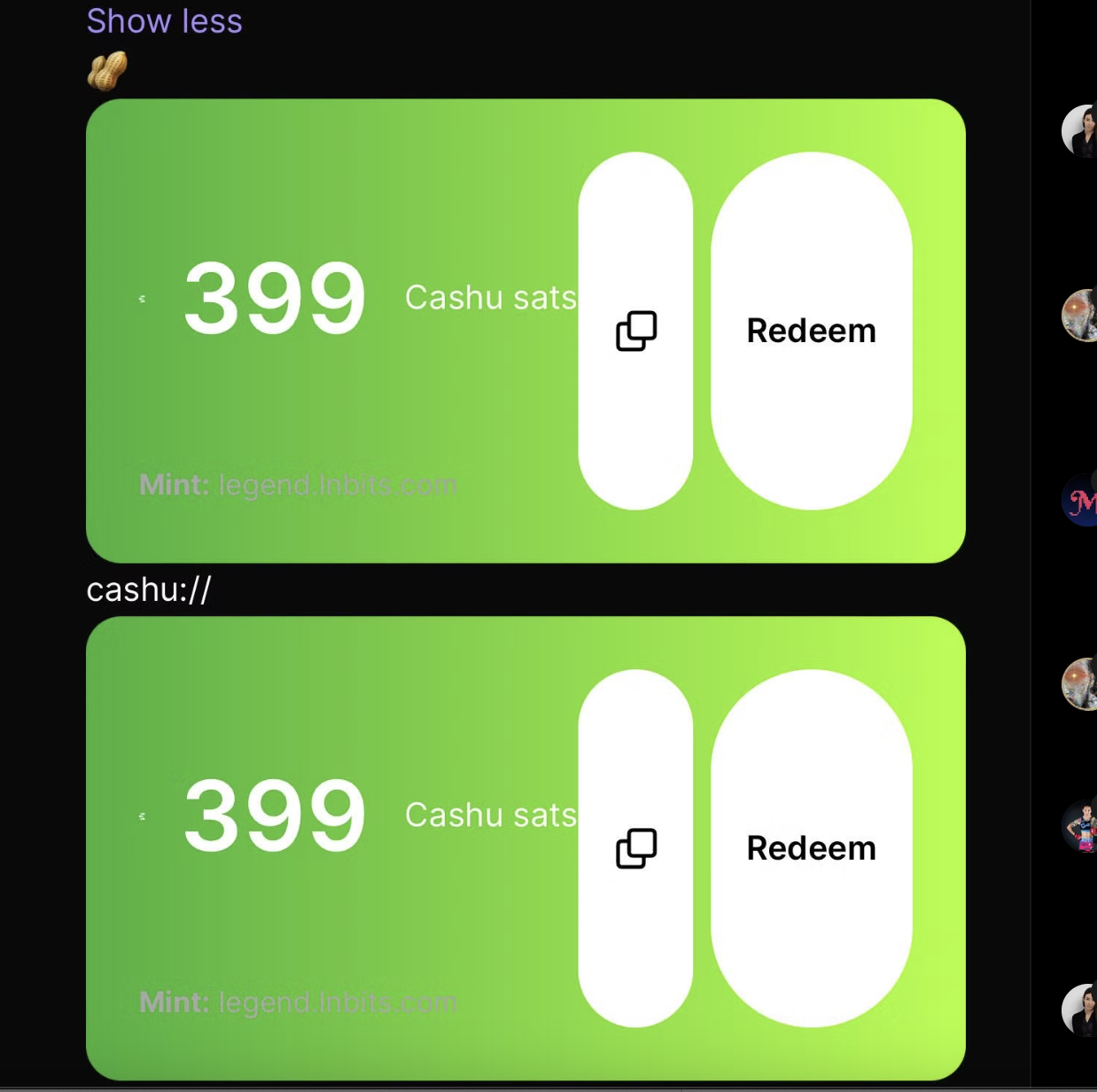
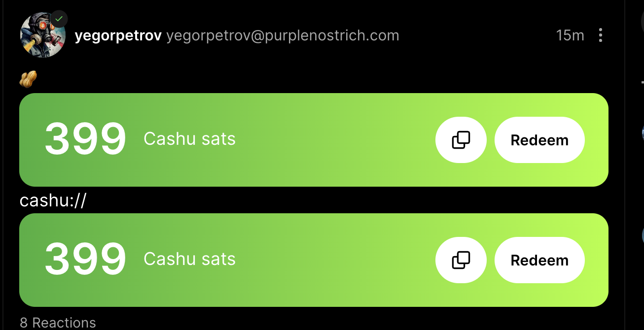
Takes way too much space, too tall, not sure why we need to list the mint there? can't we just not include that?
Remove mint line if not needed (I dont think we do)
Remove paddings on large number to fix height
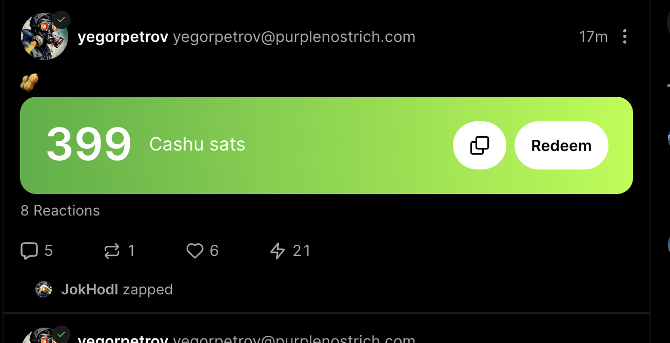
Can we render 1 instead of 2 of them? maybe use CSS to hide the 2nd?
I removed the icon and it looks cleaner
CURRENT:
CLEANED UP:
IDEAL:
1 redeem area, no cashu line, no mint line